
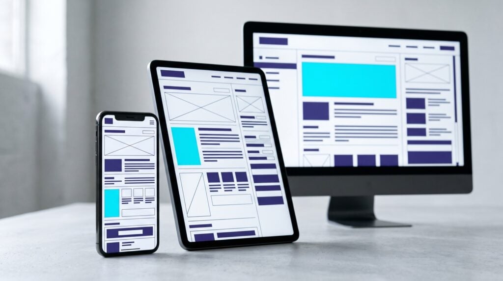
How to make a website mobile friendly in 2026 (checklist and CMS guide)

To make a website mobile friendly, use a responsive layout that reflows to any screen width, set the viewport meta tag, keep tap targets at least 44 by 44 pixels, load the main content in under 2.5 seconds on a mid-range phone, and serve the same content on mobile as on desktop so Google’s mobile-first indexing sees the full site. Test with Lighthouse and PageSpeed Insights, because Google’s Mobile-Friendly Test no longer exists.
How to make a website mobile friendly: the short answer
The short answer has five parts, and a site that passes all five is mobile friendly by any test Google still runs:
- Responsive layout. One set of HTML that reflows to every screen width, with no separate mobile site and no horizontal scrolling.
- Viewport meta tag.
<meta name="viewport" content="width=device-width, initial-scale=1">in the head of every page, so phones render at their real width instead of a shrunken desktop view. - Tap targets. Buttons, links and form fields at least 44 by 44 pixels, with space between them.
- Speed. Largest Contentful Paint under 2.5 seconds, Interaction to Next Paint under 200 milliseconds and Cumulative Layout Shift under 0.1, measured on real mobile visits.
- Same content on every device. The text, images, structured data and internal links a desktop visitor gets are the ones a phone gets, because Google indexes the mobile version.
The checklist below expands those five into 12 points you can hand to a developer.
The 2026 mobile-friendly checklist
Work through the table, then read the detail under each heading for the items that fail.
| # | Item | What to check | Pass mark |
|---|---|---|---|
| 1 | Responsive layout | Resize the browser from 320px to 1,440px wide | Content reflows, nothing overflows, no horizontal scrollbar |
| 2 | Viewport meta tag | View source on any page | Tag present with width=device-width and initial-scale=1 |
| 3 | Body text size | Read a paragraph on a phone without zooming | 16px or larger, line height around 1.5 |
| 4 | Line length | Count characters per line on a phone | Roughly 30 to 50 characters, nothing cut off at the edge |
| 5 | Tap targets | Measure buttons, links and menu items | At least 44 by 44px, with clear space between neighbours |
| 6 | Forms | Fill in your contact form on a phone | Right keyboard per field, autofill works, errors show inline |
| 7 | Largest Contentful Paint | PageSpeed Insights, mobile, field data | 2.5 seconds or under at the 75th percentile |
| 8 | Interaction to Next Paint | PageSpeed Insights, mobile, field data | 200 milliseconds or under |
| 9 | Cumulative Layout Shift | PageSpeed Insights, mobile, field data | 0.1 or under |
| 10 | Content parity | Compare mobile and desktop versions of a key page | Same text, images, structured data and internal links |
| 11 | Images and media | Check dimensions and formats in DevTools | Sized to the container, modern format, lazy loaded below the fold, no autoplay with sound |
| 12 | Navigation and interstitials | Use the site one-handed on a phone | Main actions within thumb reach, no full-screen pop-up on entry, sticky CTA does not cover content |
Responsive layout
A responsive layout uses fluid grids and flexible components so one page works at every width. Build with CSS Grid for two-dimensional layouts and Flexbox for rows and columns, size columns in percentages or fractional units rather than fixed pixels, and let images and embeds scale with max-width: 100%.
Set breakpoints by content, not by device. Resize the window until the layout looks wrong and put the breakpoint there. Device-specific breakpoints go stale every time a new phone ships. Content-based breakpoints keep working.
Where your stack allows it, use container queries so a component adapts to the space it is given rather than to the whole viewport.
Viewport and typography
The viewport meta tag tells a phone to render the page at its own width. Without it, the browser draws a desktop-width page and shrinks it, so the text is unreadable and every tap target is tiny. It belongs in the head of every page, and some CMS themes leave it out or set a fixed width.
Body text should be 16 pixels or larger. Anything smaller forces zooming. Keep line height around 1.5 and line length short enough that the eye returns to the next line without effort, which on a phone is usually 30 to 50 characters. Use fluid type with clamp() so headings scale between a minimum and a maximum size instead of jumping at breakpoints.
Check that nothing scrolls horizontally. The usual causes are a fixed-width element, an image wider than its container, a table with too many columns, or an embed with hard-coded dimensions. Tables should scroll within their own container or collapse into stacked rows.
Tap targets, forms and buttons
Every tappable element needs to be at least 44 by 44 pixels with clear space around it. Fingers are wider than cursors, and two links stacked with no gap produce mis-taps and abandoned forms.
Forms fail on mobile more than any other element. Use the right input type for each field so the phone shows the right keyboard: type="email" for email, type="tel" for phone numbers, inputmode="numeric" for postcodes. Add autocomplete attributes so the browser can fill name, email, phone and address in one tap. Put labels above fields rather than inside them as placeholders that vanish, and show errors inline next to the field rather than at the top of the page.
Make the primary button full width on small screens, high contrast, with text that says what happens next (“Get a quote”, not “Submit”). One primary action per screen. A sticky call-to-action bar works well on service pages as long as it does not cover content or the browser’s own controls.
Core Web Vitals on mobile
Core Web Vitals are Google’s three user experience thresholds, measured on real visits and reported in Search Console and PageSpeed Insights. The current pass marks are Largest Contentful Paint (LCP) at 2.5 seconds or under, Interaction to Next Paint (INP) at 200 milliseconds or under, and Cumulative Layout Shift (CLS) at 0.1 or under, each at the 75th percentile of visits.
Mobile fails these far more often than desktop because the phone is slower and the network is worse. The most common causes:
- LCP failures: an uncompressed hero image, a slider that loads five images to show one, render-blocking CSS and JavaScript, slow server response, and web fonts that delay the largest text block.
- INP failures: heavy JavaScript on the main thread (page builders, chat widgets, tracking scripts, cookie banners), so taps take a beat to respond.
- CLS failures: images and embeds without width and height attributes, fonts that swap and reflow, and banners that push content down after it has rendered.
The fixes are the same on every platform: compress and resize images, set explicit dimensions on media, defer non-critical scripts, load fonts as WOFF2 with font-display: swap, use a CDN with Australian edge locations, and remove third-party scripts you do not use. On WordPress most of this comes down to caching, image handling and plugin discipline, which we cover in speed up WordPress.
Mobile-first indexing
Mobile-first indexing means Google crawls and indexes the mobile version of your site and uses it for ranking. The rule that follows is simple: the mobile version must contain the same content, structured data and internal links as the desktop version.
Sites break this rule by hiding sections on mobile with display: none to save space, dropping the footer links, serving a cut-down mobile menu with fewer categories, or loading structured data only on desktop templates. Anything missing from the mobile version is missing from Google’s index. Collapse content into accordions if you need to save space, but keep it in the HTML.
Images and media
Serve images sized for the screen requesting them. Use srcset and sizes so a phone downloads a 600-pixel image rather than the 2,400-pixel desktop version, and use the picture element where a different crop suits mobile. Convert to WebP or AVIF with a JPEG fallback, and set width and height attributes so the browser reserves the space and the layout does not shift.
Lazy load images and embeds below the fold with the native loading="lazy" attribute, but never lazy load the hero image, because that delays LCP. Do not autoplay video with sound.
Navigation, pop-ups and interstitials
Put the actions people use most within thumb reach: the phone number, the enquiry button, the menu. On a large phone the top corners are the hardest place to reach one-handed.
Keep the menu shallow, two levels at most, with labels large enough to tap. Show the phone number as a tel: link and the address as a map link, because many mobile visitors to a service business want to call or find you, not read.
Full-screen pop-ups on entry hurt on mobile twice over. They block the content the visitor came for on a small screen, and Google treats intrusive interstitials as a page experience problem. Use a small banner or a delayed, easily dismissed prompt if you must, and never on the first screen.
How to test whether your website is mobile friendly in 2026
Google retired the Mobile-Friendly Test and the Search Console mobile usability report in December 2023, so the way to test a site in 2026 is Lighthouse, PageSpeed Insights, Chrome DevTools device mode, the Search Console Core Web Vitals report, and a real mid-range Android phone on a 4G connection.
PageSpeed Insights. Run each key page on mobile. The top section is field data from the Chrome User Experience Report (real visits over the previous 28 days), which is what Google uses. The lower section is a lab run of Lighthouse with diagnostics. If a page has too little traffic for field data, rely on the lab run and on the Search Console report at origin level.
Lighthouse. Built into Chrome DevTools. Run the mobile audit for performance, accessibility, best practices and SEO. Between them the audits catch the old mobile usability failures: a missing viewport tag, tap targets too small or too close, low contrast and illegible text.
Chrome DevTools device mode. Toggle the device toolbar to emulate phone widths and throttle the network and CPU. It is the quickest way to find horizontal overflow and layout breaks at widths between the standard breakpoints.
Search Console Core Web Vitals report. Groups your URLs into good, needs improvement and poor for mobile and desktop separately. Fix the poor group first, starting with the templates that cover the most pages.
A real phone. Emulation misses touch problems, keyboard behaviour and how the site feels on a slow connection. Test on a mid-range Android phone a couple of years old, on mobile data, away from the office wifi. Fill in the enquiry form, call the phone number, use the menu one-handed. Automated checks catch layout and speed failures, but a person is still the only test for whether the site is easy to use.
Responsive design best practices for 2026
The responsive design best practices that changed since 2024 are Interaction to Next Paint replacing First Input Delay as the responsiveness metric, container queries reaching every major browser, fluid type with clamp() replacing breakpoint-by-breakpoint font sizes, dark mode support, layouts that handle foldables and very large phones, and accessibility moving from a nice-to-have to a requirement that overlaps with mobile usability.
INP replaced FID. In March 2024 Google swapped First Input Delay for Interaction to Next Paint. FID measured only the delay before the first interaction. INP measures the responsiveness of every interaction across the visit, so sites that passed on FID commonly fail on INP because of JavaScript running after the page appears loaded.
Container queries. Components can now respond to the width of their container rather than the viewport, which makes reusable components practical across layouts.
Fluid type. Font sizes that scale smoothly between a minimum and a maximum with clamp(), so headings fit the screen at every width without a stack of media queries.
Dark mode. Phones are set to dark mode more often than desktops. Respect the device setting (the prefers-color-scheme media query) with a tested dark palette, or explicitly force light mode, rather than leaving white text on a suddenly white background.
Foldables and large phones. Screens now range from narrow folded displays to phones wider than an old tablet. Content-based breakpoints and fluid layouts handle this. Device-based breakpoints do not.
Accessibility. Colour contrast of at least 4.5 to 1, visible focus states, labels on every form field and captions on video are accessibility requirements that also fix mobile usability. Lighthouse scores them.
How to make a mobile-friendly website on common CMS platforms
Every mainstream CMS can produce a mobile-friendly site. The failures come from themes, plugins and uploaded media, not from the platform, so the fixes are about what you add to the CMS rather than which one you chose.
WordPress
On WordPress, mobile problems come from the theme and the plugin stack. Choose a block theme or a lightweight classic theme with a responsive grid, and be careful with page builders that inject inline CSS and JavaScript into every page, because they are the most common cause of INP failures we see.
Install one image optimisation plugin that resizes on upload, converts to WebP and adds lazy loading, and one caching plugin, then stop. Test a key page in PageSpeed Insights after every plugin install, because a single plugin can add a script to every page. Keep the viewport tag in the theme header, and check the mobile menu shows every category the desktop menu does. PWD’s WordPress web design builds start from the mobile layout and add the desktop view second.
Shopify
Shopify themes are responsive and the checkout is mobile-ready by default, so the problems are app bloat and product images. Every app you install can add scripts to every page. Audit the app list quarterly and remove what is not earning its place.
Use the theme editor’s mobile preview for the homepage and collection pages, upload product images at a sensible size rather than raw camera files, and keep the number of images per product page under control. Check that the sticky add-to-cart bar and the announcement bar do not overlap on small screens. Our Shopify website design work includes a mobile speed pass on every theme.
Webflow
Webflow gives you explicit breakpoints (desktop, tablet, mobile landscape and mobile portrait), and the trap is editing the desktop layout and forgetting to check the smaller ones. Review every section at each breakpoint before publishing.
Interactions built for hover break on touch, so give every hover interaction a tap equivalent or remove it on mobile. Compress assets before upload, because Webflow serves what you give it, and set lazy loading on images below the fold in the image settings.
Common mistakes that make a site fail on mobile
- Full-screen pop-ups on entry. They block the content, and Google counts them against page experience.
- Desktop-sized images. A 3MB hero image on mobile data fails LCP by itself.
- Text under 16 pixels. Forces zooming and is the first thing an accessibility audit flags.
- Tap targets too small or too close. Mis-taps on menus and forms.
- Content hidden on mobile. Anything removed from the mobile version is removed from Google’s index.
- Autoplaying video with sound. Startles the visitor, drains data and delays the page.
- Forms without the right input types. The wrong keyboard, no autofill, errors at the top of the page.
- Ignoring landscape and large phones. Layouts that only work at 375 pixels portrait break on everything else.
Get it fixed
Failing the checklist? PWD’s Perth web team will audit your site on real devices and fix what fails: layout, speed, forms, navigation and the CMS-specific issues above, at a fixed scope agreed before we start. Everything is built and tested in-house in Perth by the team behind our web design Perth work.
Get a mobile audit, or call 08 6146 0195.